The Design System Paradox
Every organization wants a design system. Few succeed in making one that scales.
The typical trajectory: enthusiastic start → component library grows → adoption plateaus → fragmentation returns → system abandoned.
We've built design systems for organizations ranging from 50 to 2,000 engineers. Here's what separates the systems that survive from the ones that don't.
1. Tokens Before Components
Most teams start with components. That's backwards.
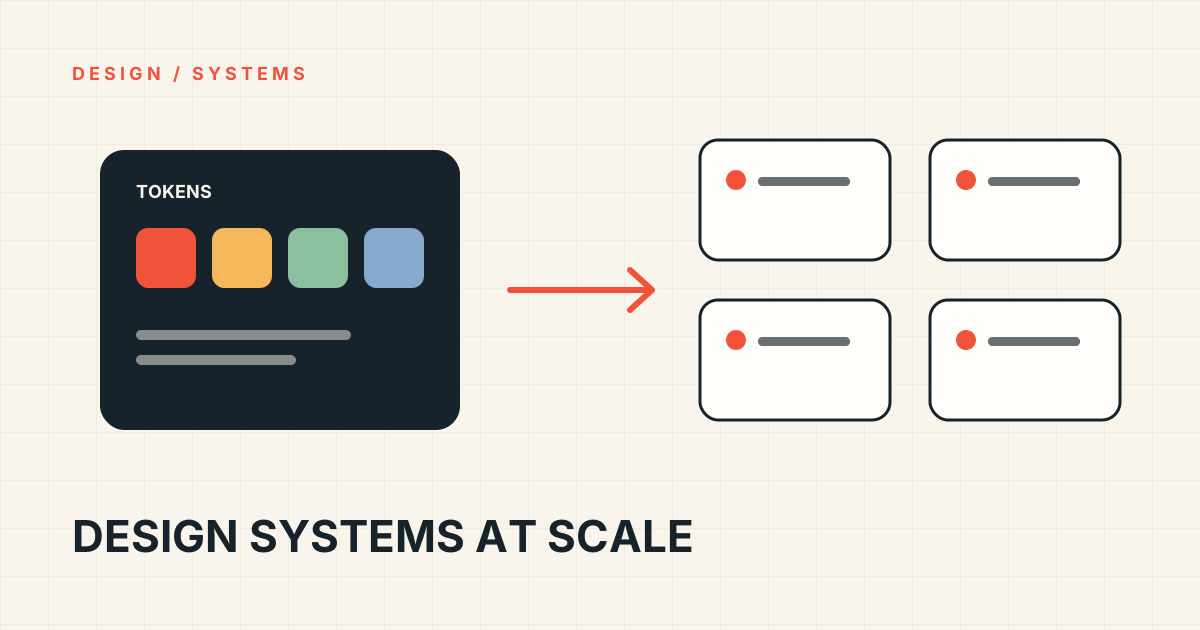
Design tokens—colors, spacing, typography, shadows, motion—are the atomic units. They encode design decisions in a platform-agnostic format. Components are merely expressions of those tokens.
Our token architecture:
{
  "color": {
    "primary": { "500": "#0066CC", "600": "#0052A3" },
    "semantic": {
      "background": { "primary": "{color.neutral.50}", "inverse": "{color.neutral.900}" }
    }
  },
  "spacing": { "scale": [0, 4, 8, 12, 16, 24, 32, 48, 64] },
  "typography": { "fontFamily": { "sans": "Inter", "mono": "JetBrains Mono" } }
}
Tokens export to CSS custom properties, Figma variables, iOS/Android native, and JSON for any platform.
2. Composition Over Configuration
A Button with 47 props is a code smell. It means you're building a framework, not a component.
Instead, compose:
// ❌ Configuration hell
<Button variant="primary" size="lg" loading={true} leftIcon={Spinner} rightIcon={ArrowRight} fullWidth onClick={handleClick} />

// ✅ Composition
<Button>
  <Button.Content>
    <Spinner aria-hidden="true" />
    <Button.Text>Submit</Button.Text>
    <ArrowRight aria-hidden="true" />
  </Button.Content>
</Button>
Compound components give consumers control without exploding the API surface.
3. Accessibility Is Not Optional
Every component ships with:
- ARIA attributes baked in
- Keyboard navigation tested
- Focus management handled
- Screen reader verified
- Color contrast validated
We use automated testing (axe-core in CI) and manual testing with NVDA/VoiceOver. No exceptions.
4. Versioning Like a Product
Semantic versioning. Changelogs. Migration guides. Deprecation policy (2 major versions).
Breaking changes get:
- 6-month notice
- Automated codemods
- Parallel support during transition
5. Ownership Model
A design system is a product. It needs:
- Dedicated team (not "someone's 20% time")
- Roadmap driven by consumer feedback
- SLA for bug fixes and requests
- Usage analytics (which components, which versions)
The Result
Our current system:
- 200+ components
- 50+ products
- 200+ engineers
- 94% adoption rate
- 40% faster feature delivery
- Zero critical accessibility issues
The investment pays for itself in 6 months.
Want to discuss your design system challenges? Let's talk.